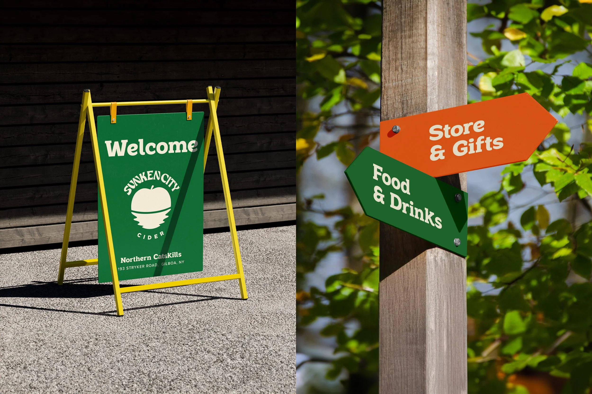
SUNKEN CITY CIDER
Brand Identity
Sunken City Cider sits creek-side in the Northern Catskills, where good drinks, live music, and easy vibes are more than a location: it’s a lifestyle. When they came to Twice On Sunday, the goal was simple: build a brand that feels like you’re already there, drink in hand.
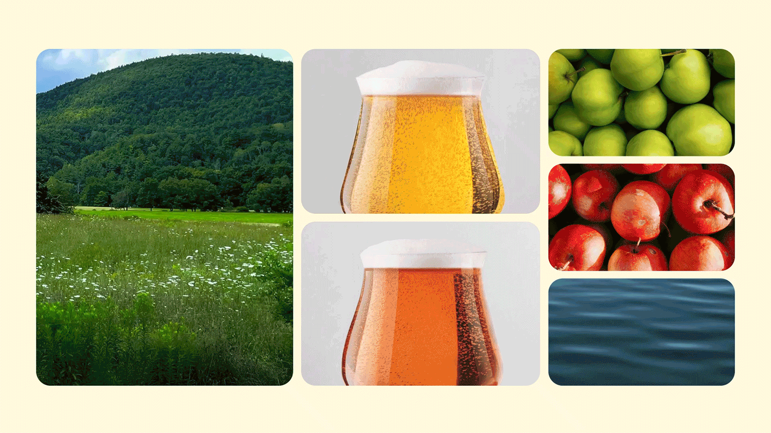
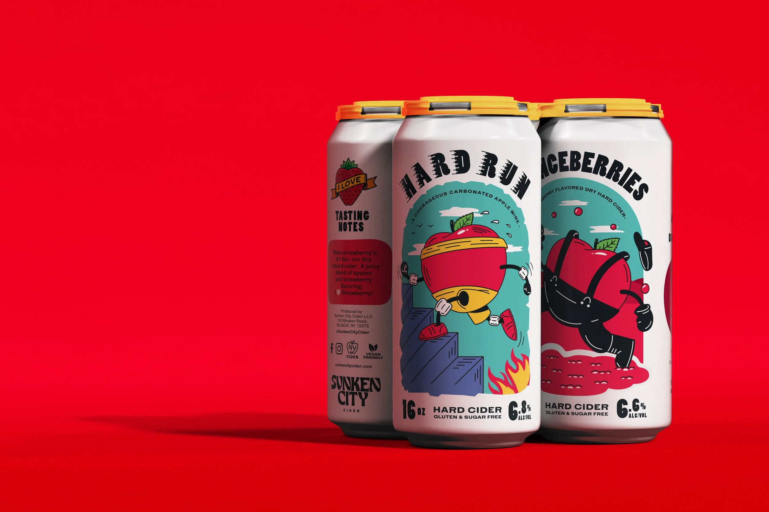
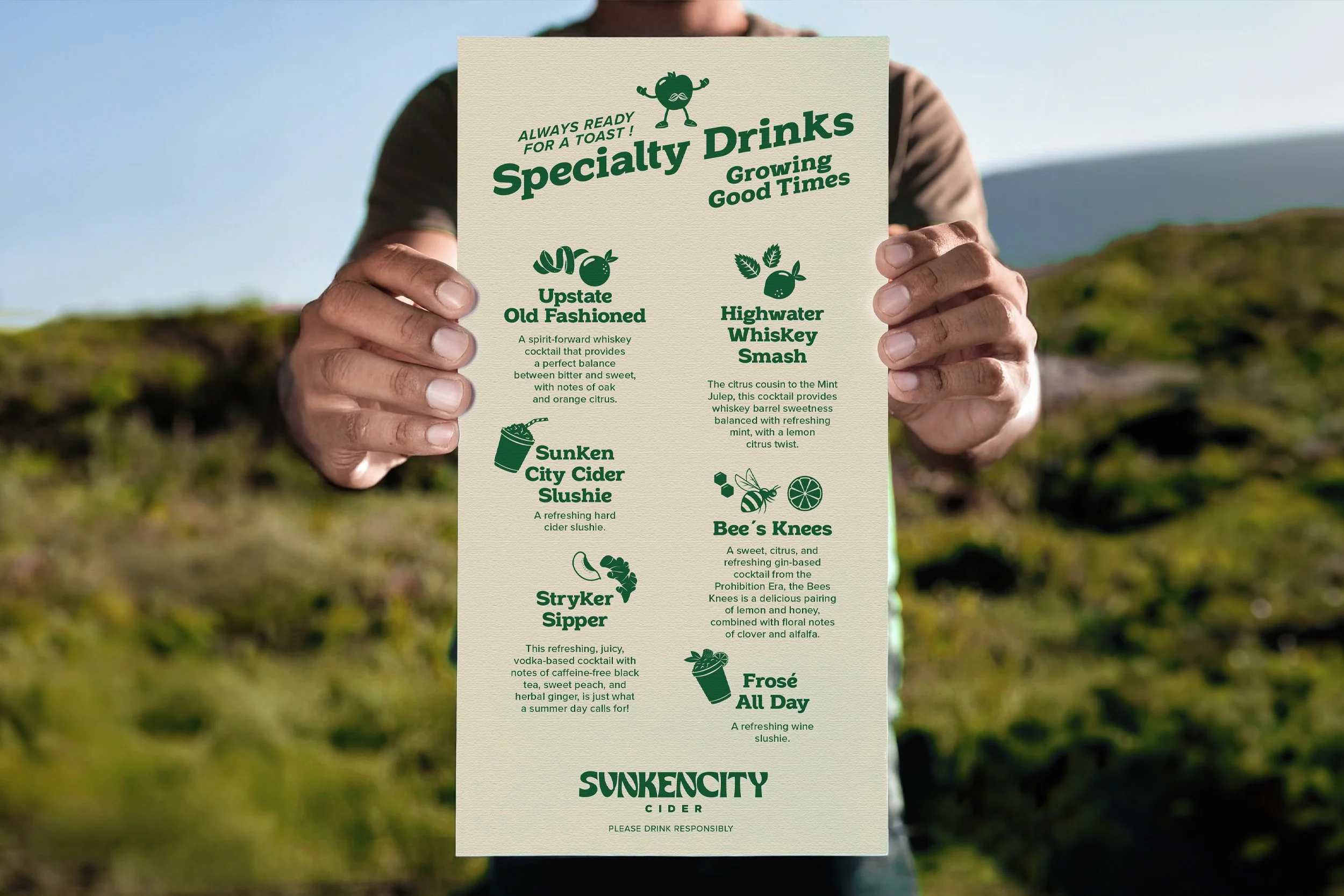
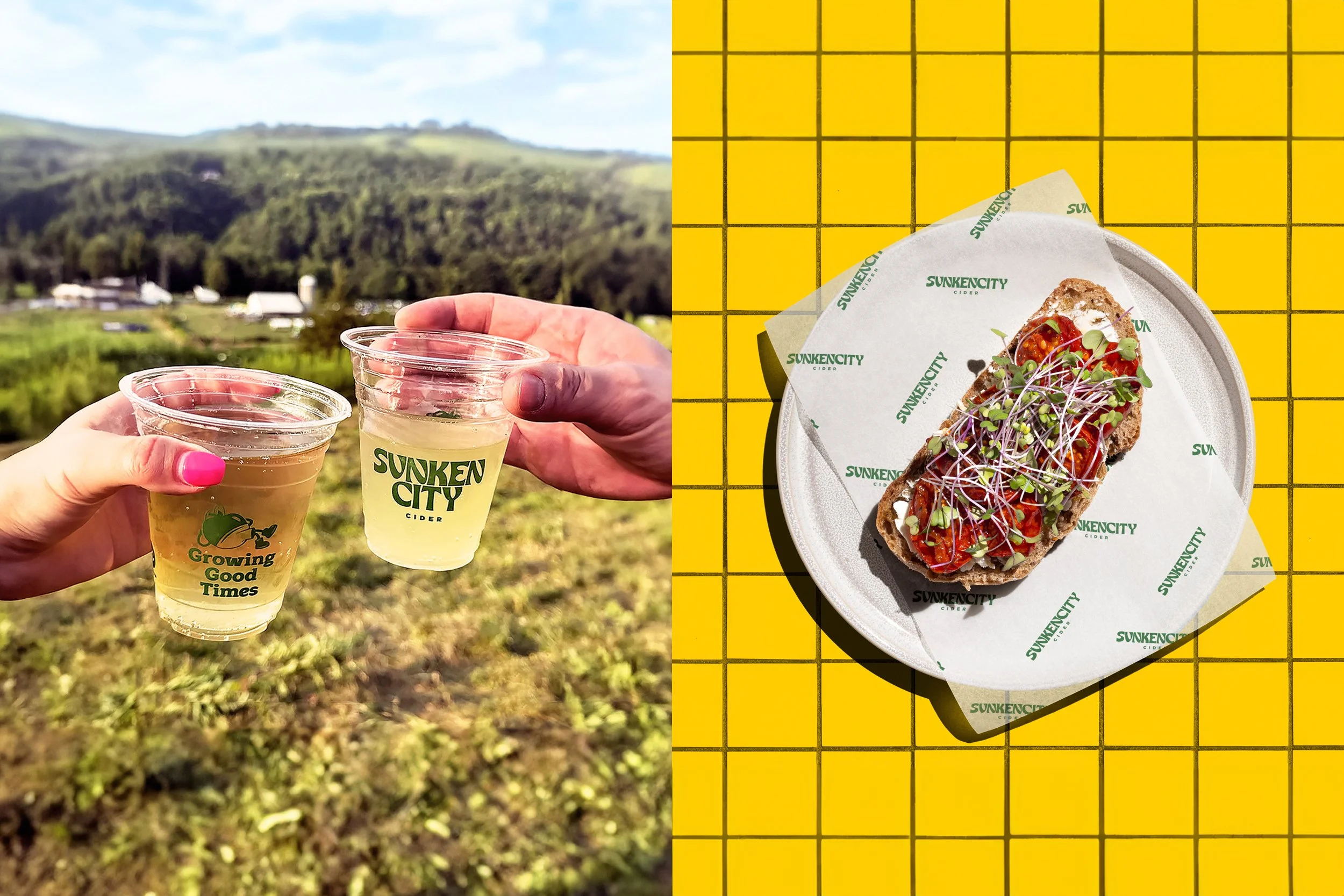
We took the “sunken city” story— the hidden reservoir under Gilboa— and turned it into a playful identity system. Bold, craft-forward logo work, a color palette inspired by mountains and orchards, and flexible graphic elements that show up strong across cans, merch, menus, and event promos.
Every detail was designed to feel handcrafted and rooted in place, but never too serious. Because at Sunken City, it’s about great cider, good people, and that “why don’t we just stay awhile?” feeling.
The result: a brand that’s local, lively, and built to expand— from cans on shelves to festivals by the creek. Cheers to sinking into the moment.